Introduction
Automanager, a software company, offers products tailored for dealerships. One such product is WebManager, designed to assist dealerships in customizing their websites and presenting their car inventory online.
Challenges
The challenges I needed to address were that the websites and themes were outdated and difficult to navigate. Visitors had trouble finding the data they were looking for, which was somewhat confusing.
Goals
To enhance user experience and optimize website functionality by updating outdated websites and themes, improving navigation ease, and ensuring visitors can easily find the information they seek.

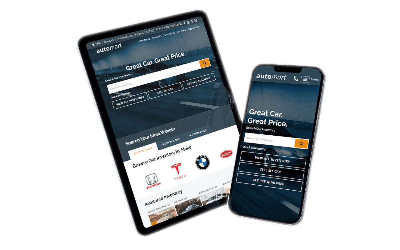
AutoMart Template Website Layout

Process
Research & User Insights
- Research
- User Personas and Scenarios
Analysis
- Information Architecture
- Define Goals
Design Development
- Wireframing
- Prototyping
Visual Design
Visual Design
- High Fidelity
Testing and Evaluation
- Usability Testing
- Iterate and Refine
Implementation and Launch
- Implementation and Handoff
- Launch and Evaluation
Research & User Insights
In this project, I utilized User Interviews to gather qualitative insights and analyzed Website Analytics to collect quantitative data. Additionally, I conducted competitor research to pinpoint their strengths and weaknesses, with the goal of refining our template design for clients.
I began by analyzing Website Analytics as it provided a quick way to understand why people were leaving the website. Using tools like Google Analytics, I tracked website traffic, user engagement metrics, and conversion rates. I analyzed quantitative data such as page views, bounce rates, time on page, and click-through rates to identify popular pages and areas for improvement. Additionally, I utilized heatmaps and session recordings to visually represent user interactions and pinpoint areas of interest or frustration on the website.
Next, I began conducting interviews. These involved one-on-one sessions with a diverse group of stakeholders, including website visitors, dealership staff, and management. I utilized open-ended questions to delve into their experiences, preferences, pain points, and expectations regarding the website. Through these interviews, I gathered qualitative insights into user behaviors, motivations, and decision-making processes.
Following the completion of my research, I analyzed our direct competitors, including Dealer Car Search, V12, and Dealer Inspire, to identify their strengths and weaknesses. This analysis aimed to pinpoint areas for improvement, especially considering their ability to attract and potentially acquire some of our clients onto their platforms.
Demographics: Sarah is a 35-year-old professional working in the city. She is tech-savvy and values convenience in her busy lifestyle.
Goals: Sarah wants to find a reliable car within her budget quickly. She prefers browsing online and wants a seamless experience to locate dealership cars, compare options, and schedule test drives.
Pain Points: Sarah gets frustrated with cluttered websites or ones with confusing navigation. She dislikes having to scroll through endless listings and wants clear contact information for dealerships.
Demographics: Mike is a 45-year-old small business owner who needs to sell his car quickly due to a recent upgrade. He values efficiency and simplicity in online transactions.
Goals: Mike aims to easily submit his car’s details to multiple dealerships and receive competitive offers promptly. He wants a hassle-free process and expects clear guidance on how to proceed.
Pain Points: Mike finds it time-consuming to navigate through complicated forms or websites lacking clear instructions. He wants reassurance that his information is securely handled and that he’ll receive timely responses from dealerships.
Demographics: David is a 50-year-old seasoned dealership manager with over two decades of experience in the automotive industry.
Goals: David aims to streamline the process of acquiring new inventory and attracting potential buyers to the dealership’s website. He seeks efficient tools to manage inventory listings and communicate with interested customers.
Pain Points: David finds it challenging to keep up with technological advancements and adapt dealership operations to meet changing consumer expectations. He seeks user-friendly solutions that simplify inventory management and enhance customer engagement.
Demographics: Emily is a 28-year-old marketing professional who leads a busy lifestyle. She relies heavily on her smartphone for daily tasks and prefers websites that are optimized for mobile devices.
Goals: Emily wants to search for cars, get pre-approval for financing, and schedule appointments directly from her phone. She values websites with intuitive navigation and fast loading times.
Pain Points: Emily finds it frustrating when websites are not mobile-friendly or take too long to load on her device. She wants seamless integration between the desktop and mobile versions of the website for a consistent user experience.
Analysis
Key Findings
Simplify the process for website visitors to locate dealership cars:
- Implement a prominent search bar on the homepage allowing visitors to search for cars by make, model, or other relevant criteria.
- Provide clear navigation links or buttons to popular car categories or featured vehicles.
- Include filters to refine search results based on price, mileage, year, etc.
Enable website visitors to easily sell their cars to the dealership:
- Create a dedicated section or form where visitors can easily input their car’s details for selling purposes.
- Guide users through a step-by-step process, making it simple to provide necessary information such as car make, model, year, condition, and contact details.
- Offer an option for users to upload photos of their car for better evaluation by the dealership.
Implement a straightforward navigation system to guide website visitors to the pre-approval page:
- Clearly label and highlight the pre-approval page in the navigation menu.
- Use clear and descriptive call-to-action buttons or links directing users to the pre-approval page from relevant sections of the website.
- Provide informative content on the pre-approval process to help users understand its benefits and requirements.
Provide inventory search functionality across all dealership inventories:
- Integrate a comprehensive search feature that allows users to search across all dealership inventories simultaneously.
- Offer advanced search options such as filtering by price range, vehicle type, features, and location.
- Ensure search results are displayed in a clear and organized manner, with relevant information and thumbnail images for each listing.
Ensure accessibility of dealer contact information and business hours on the site:
- Place contact information prominently on every page, such as in the header or footer.
- Provide a dedicated “Contact Us” page with detailed contact information, including phone numbers, email addresses, and a contact form.
- Display business hours clearly and prominently, possibly in the footer or on a separate page for easy reference.
Here’s a summary of my findings for competitor research:
Dealer Car Search: Their website is well-designed, but the dealership search functionality isn’t user-friendly, and they lack a diverse range of design options for dealers to choose from.
Dealer Inspire: Their website template appears overcrowded, making it difficult for visitors to find information easily. They have too many calls to action, and on mobile devices, the content is too close together.
V12: offers simple websites with a search feature allowing dealers to select their make, model, and brand. However, all of their website templates appear outdated.
Design Development
Wireframe
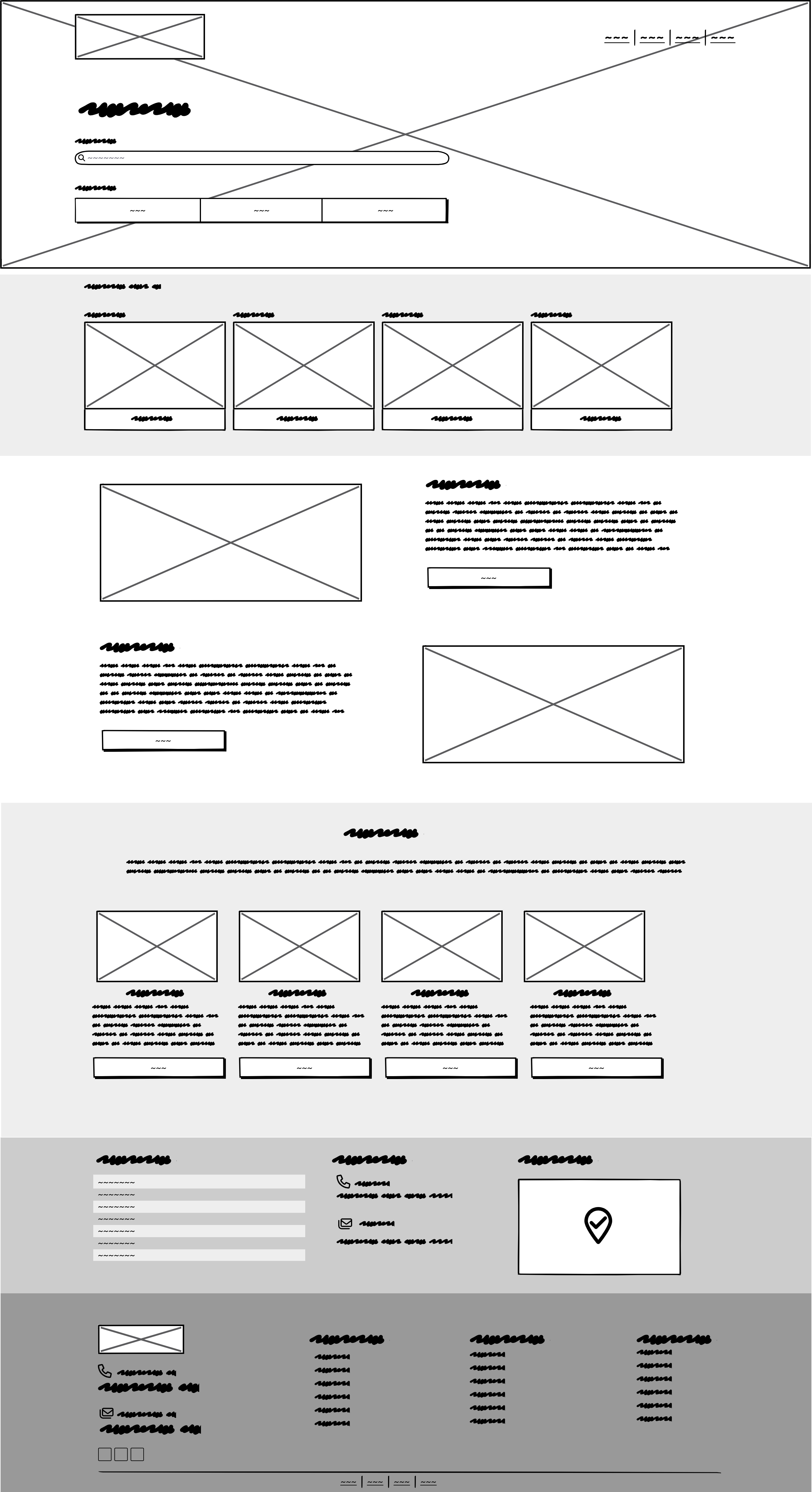
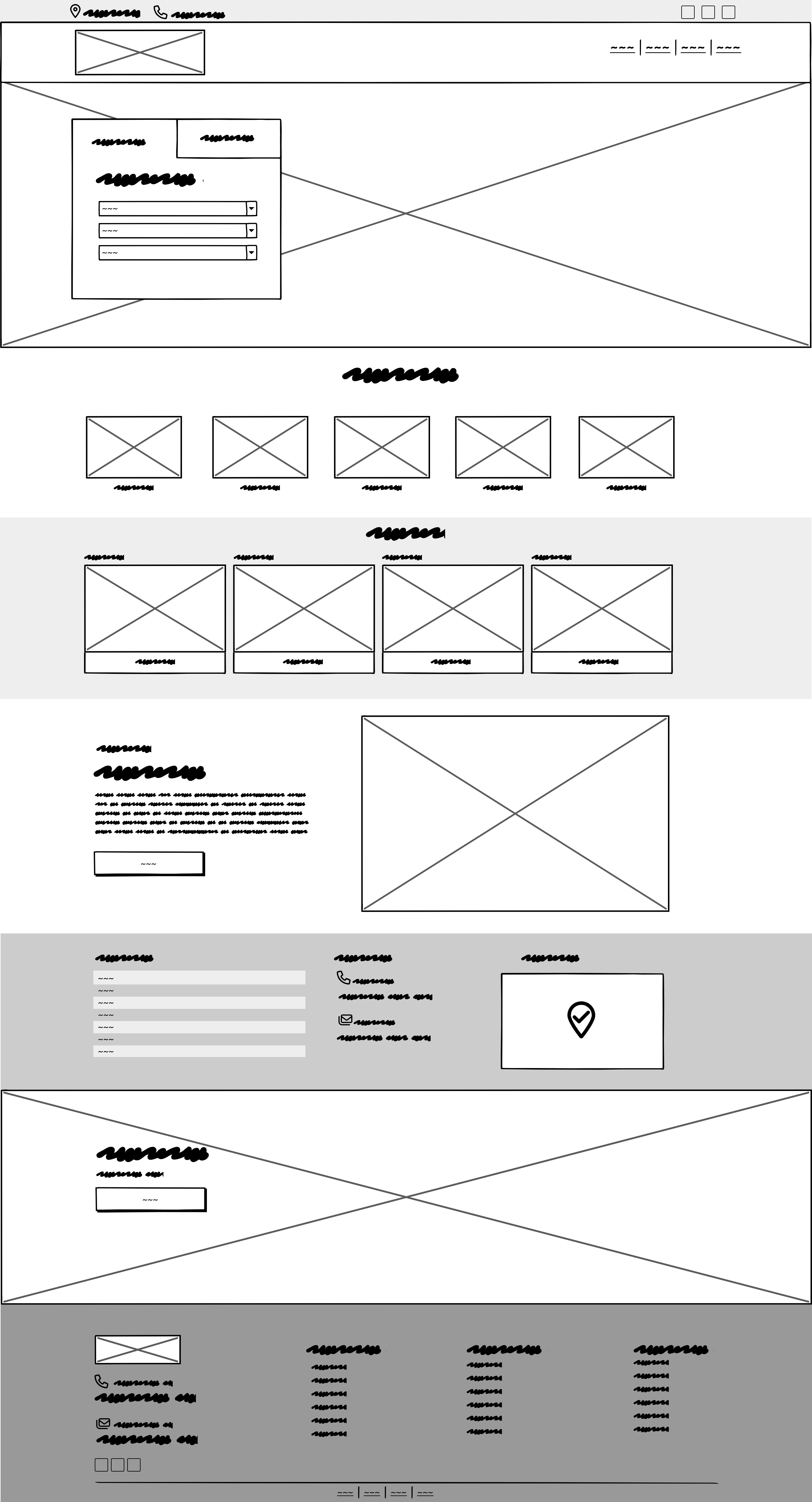
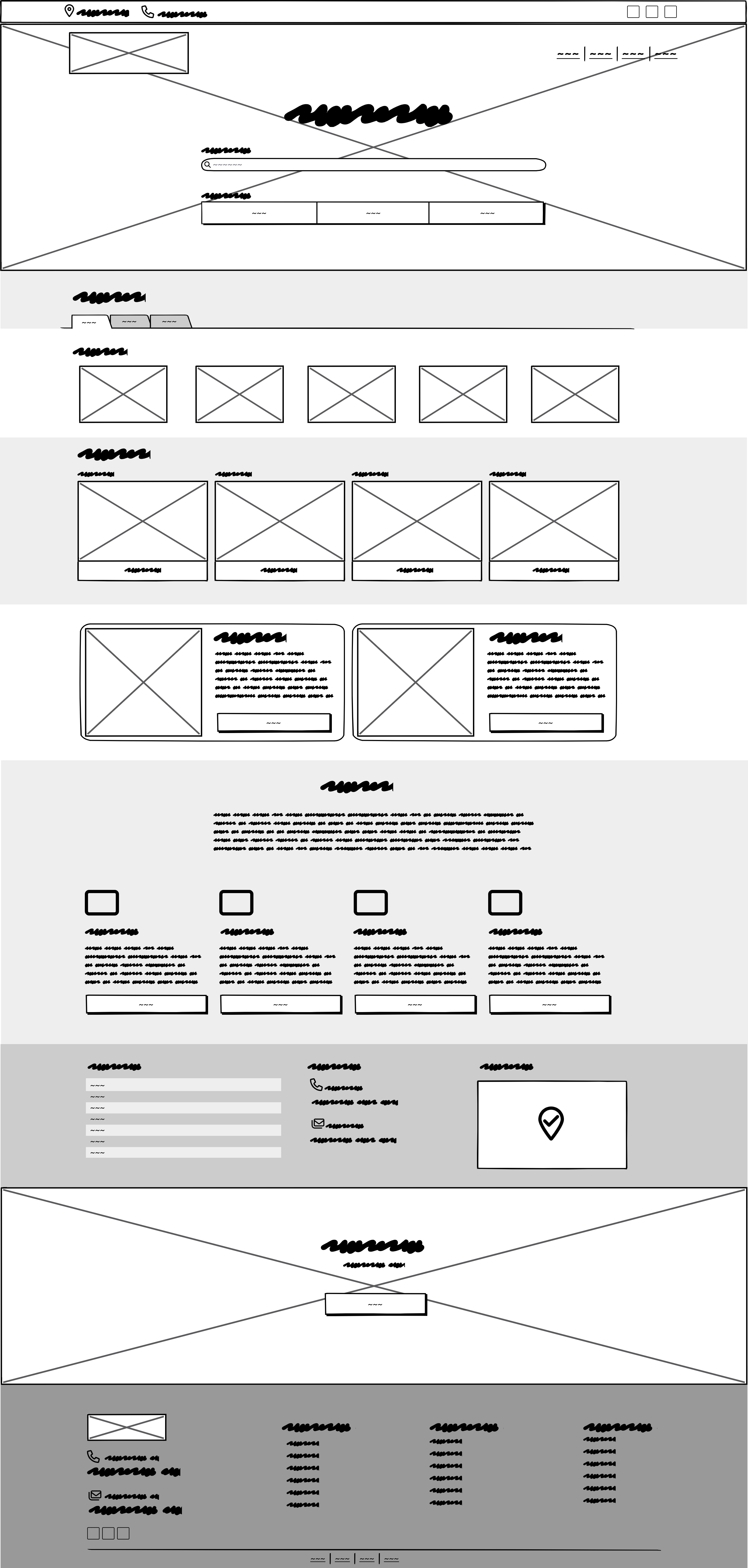
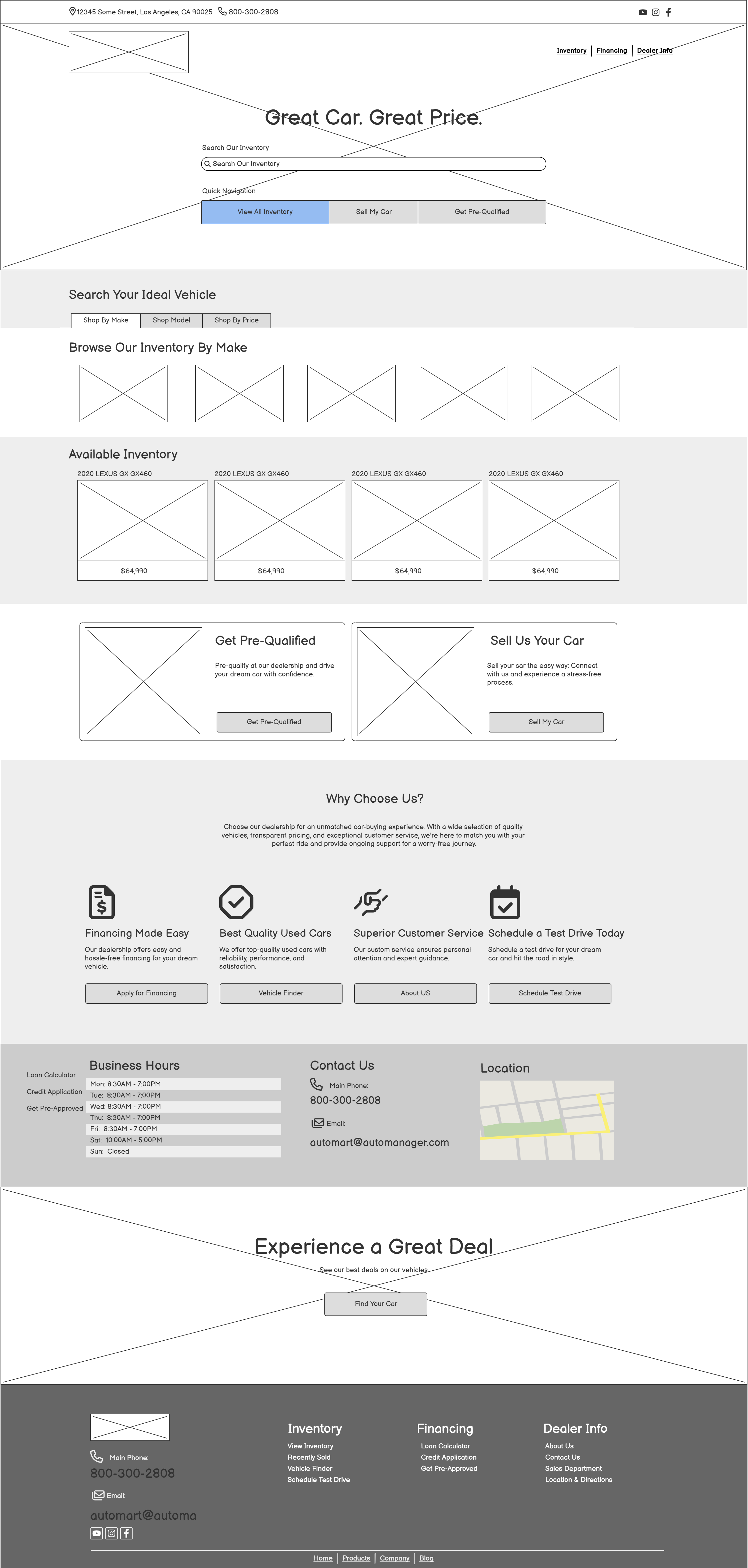
Based on the analysis I conducted, I developed three wireframes to assess which one would be optimal for the new team. Following interviews with development and product team to gather comments and feedback, we collectively decided to proceed with the third wireframe design.
Prototype
Following interviews with the developers and product managers, I proceeded to design a prototype for the wireframe, which was subsequently approved.
Visual Design
High Fidelity
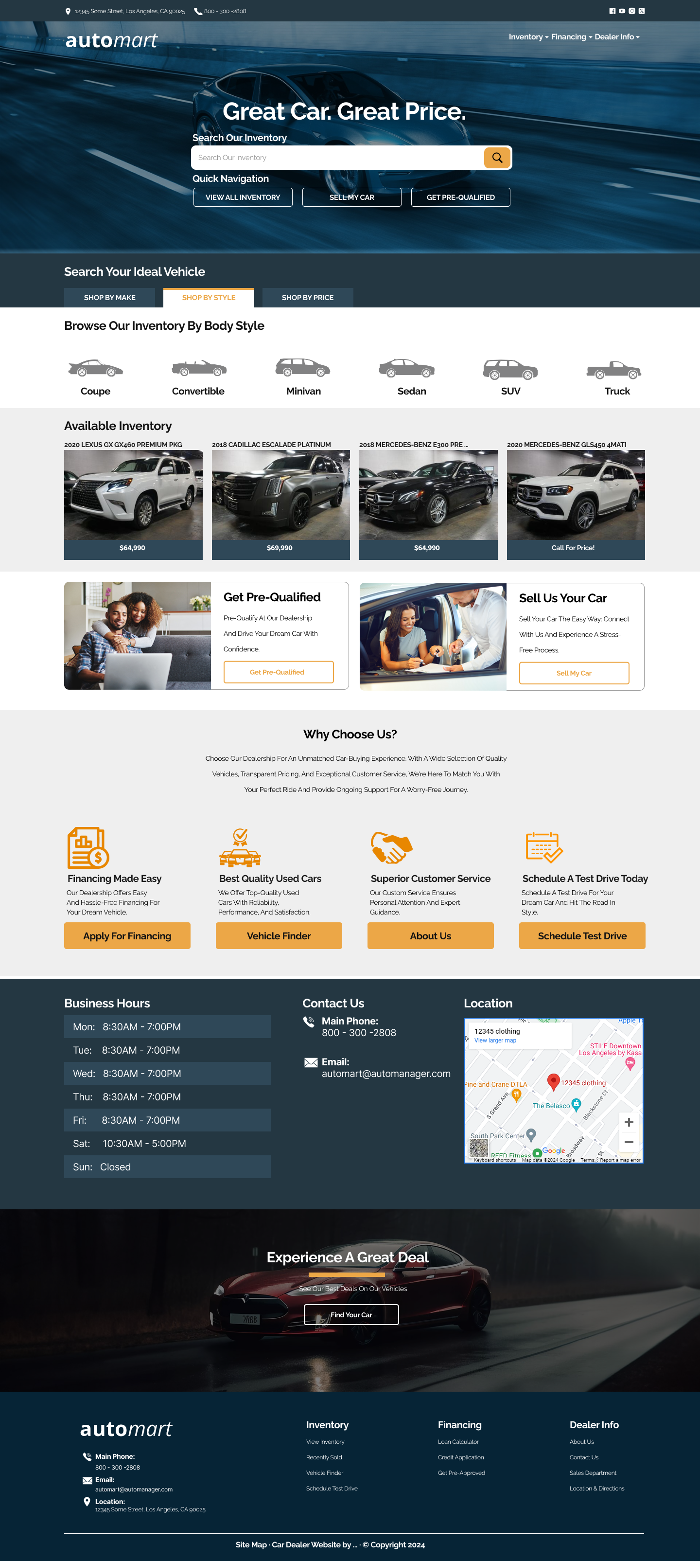
In my portfolio project, I used Figma to create the high-fidelity version. I also set up meetings with our SEO and marketing teams to make sure everything was on track. I asked the SEO team to create relevant content for the theme.
For the design, I chose a simple combination of blue and orange based on competitor research and interviews. This helped the theme stand out effectively.
Testing and Evaluation
Usability Testing
I presented both desktop and mobile versions of the design and asked participants to provide feedback while engaging with the design. I observed their facial expressions to gauge their reactions and noted any areas where they seemed particularly interested or engaged for further investigation.
During the A/B testing phase, it became evident that for older users, the accent color for CTAs was not sufficiently clear. Additionally, on the mobile version, there was an issue with a long scrolling bar.
Additionally, it was noted that the font size, especially for the vehicle price, could be increased to enhance readability. Another observation was the suggestion to replace the section showcasing a few vehicle features with a slider displaying all featured vehicles for improved user experience.
Iterate and Refine
1.Improving Accent Color for CTAs: I will explore different color options and increase the contrast between the CTA buttons and their backgrounds. I’ll conduct usability testing with older users to determine which color schemes are most easily distinguishable.
2.Resolving Long Scrolling Bar Issue on Mobile: I’ll optimize the layout to reduce excessive scrolling on the mobile version. This might involve condensing content, implementing a sticky header for easier navigation, or organizing information more efficiently with pagination or tabbed sections.
3.Increasing Font Size for Vehicle Price: I’ll enhance readability by increasing the font size of the vehicle price. I’ll ensure that the font size is large enough to be easily legible, especially on mobile devices where screen space is limited. I’ll conduct user testing to determine the optimal font size that balances readability with aesthetics.
4.Replacing Section with Vehicle Features with a Slider: I’ll implement a slider or carousel feature to showcase all featured vehicles instead of just a few. This will allow users to easily browse through a variety of options without feeling overwhelmed. I’ll ensure that the slider is intuitive to use and doesn’t negatively impact page load times.
Implementation and Launch
Implementation
After editing and adjusting the changes, I organized the content and then transferred the design to our development team. I also assisted them with implementation by exporting all images and CSS code.
After launching the website, I continued tracking its performance and spoke with several clients to identify any pain points that needed addressing. Here are some of the issues identified:
1. Minimize the length of scroll bars to prevent excessive scrolling.
2. Enhance the mobile viewing experience and optimize the website’s layout for smaller screens.
3. Implement technologies like lazy loading or infinite scrolling to improve website performance.
4. Improve website accessibility across all devices.
5. Display the dealership’s social media accounts to increase brand awareness and attract more leads and visitors from other channels.
I discussed these issues with our development team and made adjustments to ensure everything was functioning smoothly.
Continuous process
Ongoing improvement is a continuous process, and here are some enhancements we plan to implement in the future:
1. Adding more color schemes.
2. Enhancing the hero image and supporting video background.
3. Creating a dedicated version for RVs and ATV dealership.
The Results
This comprehensive approach not only meets immediate business needs but also reflects our commitment to enhancing user experience and driving sustained growth for the dealership.
- Achieved a more than 40% increase in website traffic.
- Boosted conversion rates for both leads and sales.
- Enhanced user engagement significantly; visitors can now find information more easily, leading to a 30% decrease in website bounce rate.
- Received positive feedback from our dealerships indicating that customers are satisfied with their interactions and providing positive feedback.
